A logo rebrand not going so well is not uncommon — just ask Jaguar, or GAP, or Facebook in the aughts. Now, Cracker Barrel is in the middle of a viral controversy over its latest redesign. Last week, the company unveiled a new logo with a cleaner-looking font that removed the old man and the barrel from the design. The phrase “Old Country Store” was also removed. It’s Cracker Barrel’s fifth rebrand in its 56-year history.
Naturally, social media has not been kind about the rebrand, and everyone has seemed to weigh in, from President Donald Trump to rival restaurants like Steak ‘n Shake.
Still, Cracker Barrel is staying the course. On its website on Monday, the restaurant chain issued a statement that said: “You’ve shown us that we could’ve done a better job sharing who we are and who we’ll always be.”
Related: Struggling to Explain What You Sell? This Beverage Brand Was Too — Until It Tried This 4-Step Fix
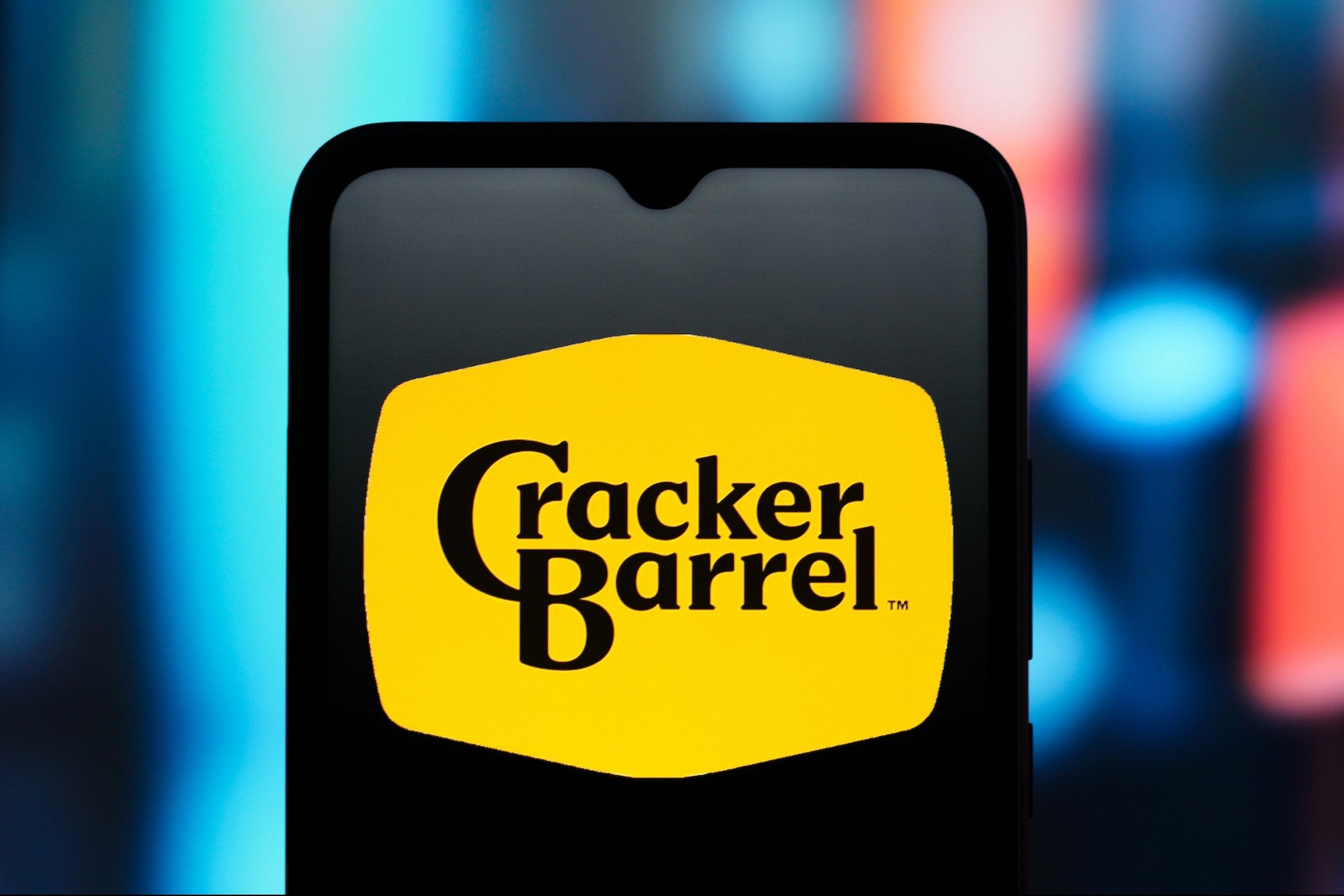
![]() The new logo. Cracker Barrel
The new logo. Cracker Barrel
The company noted that the “logo and remodels may be making headlines,” but many things aren’t going away, including “rocking chairs on the porch, a warm fire in the hearth, peg games on the table, unique treasures in our gift shop, and vintage Americana with antiques pulled straight from our warehouse in Lebanon, Tennessee.”
“If the last few days have shown us anything, it’s how deeply people care about Cracker Barrel,” the statement said. “We’re truly grateful for your heartfelt voices.”
The “old timer,” Uncle Herschel, however, might be gone from the logo for good, but he’s “not going anywhere — he’s family,” the statement said. “He’ll still be on our menu (welcome back Uncle Herschel’s Favorite Breakfast Platter), on our road signs, and featured in our country store.”
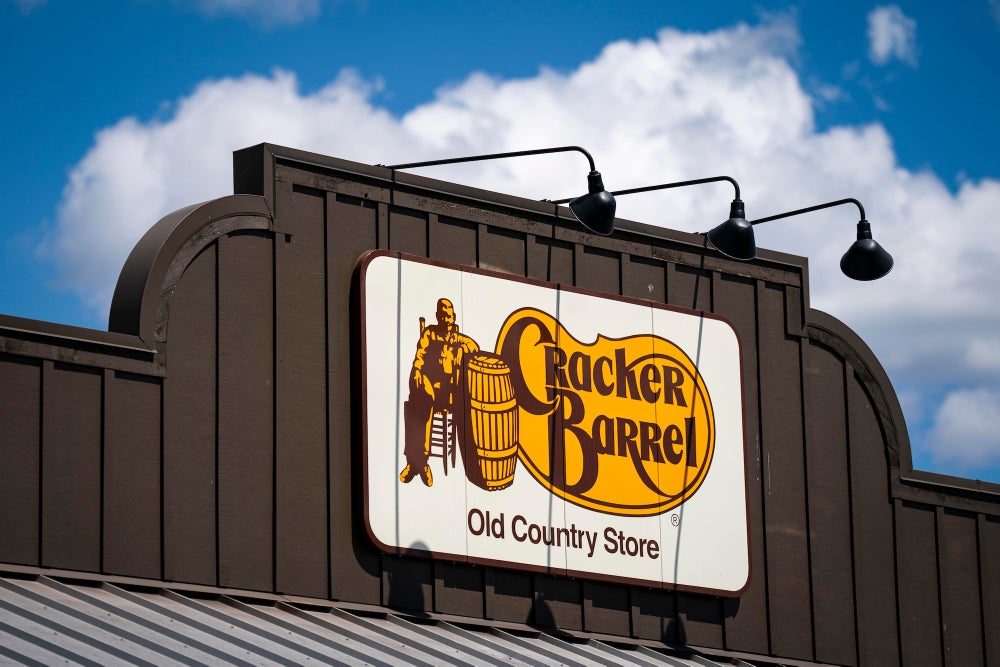 A Cracker Barrel restaurant, featuring the company’s old logo, in Sterling, Virginia, US, on Tuesday, Aug. 26, 2025. Al Drago/Bloomberg | Getty Images
Related: Gwyneth Paltrow Closes the Loop on the Astronomer, Coldplay Concert Scandal
The change was part of a wider, forward-facing company update.
Cracker Barrel has updated the interior of many of its restaurants, which previously displayed antiques in a maximalist design, and now features more neutral paint colors and modern furniture. A company representative told Country Living last year that 25-30 stores would be getting the refresh.
“We also want to be sure Cracker Barrel is here for the next generation of families, just as it has been for yours,” the statement continued. “That means showing up on new platforms and in new ways, but always with our heritage at the heart. We take that responsibility very seriously. We know we won’t always get everything right the first time, but we’ll keep testing, learning, and listening to our guests and employees.”
A logo rebrand not going so well is not uncommon — just ask Jaguar, or GAP, or Facebook in the aughts. Now, Cracker Barrel is in the middle of a viral controversy over its latest redesign. Last week, the company unveiled a new logo with a cleaner-looking font that removed the old man and the barrel from the design. The phrase “Old Country Store” was also removed. It’s Cracker Barrel’s fifth rebrand in its 56-year history.
Naturally, social media has not been kind about the rebrand, and everyone has seemed to weigh in, from President Donald Trump to rival restaurants like Steak ‘n Shake.
Still, Cracker Barrel is staying the course. On its website on Monday, the restaurant chain issued a statement that said: “You’ve shown us that we could’ve done a better job sharing who we are and who we’ll always be.”
The rest of this article is locked.
Join Entrepreneur+ today for access.